 Data Team
Expressive rendering and UI in Tarot
Building the domain-specific language for Chalkbeat's social media card generator
It is a truth universally acknowledged that a newsroom in possession of a data team must be in want of a social card generator.
This kind of tool is an easy win if you’re just starting out in a strange newsroom: it’s immediately useful, highly visible, not terribly difficult to build, and it helps make inroads with everyone from the engagement team to the managing editors. Vox has one, as does NPR. Politico rewrote NPR’s Quotable from scratch for theirs. It was one of my first projects at the Seattle Times, which then got a Svelte adaptation at the Star-Tribune.
While they’re easy to write, building a social card generator that’s future-proof is less straightforward. For example, the Seattle Times tool places and renders the card’s contents using hand-written JavaScript, which means it’s very fast and can do some fun interactive image positioning tricks, but additional layouts need to be manually written (and so they never were). By contrast, NPR’s Lunchbox tool renders a styled block of the HTML document to an image using an external library. That makes it easy to create new looks using CSS, but there’s still only really one combination of text elements, and you’re at the mercy of the rendering library in terms of display support.
To build Chalkbeat’s social card generator, Tarot, I wanted something that offered flexibility without sacrificing control. The resulting architecture supports multiple templates with customized color themes, including any number of content blocks and customized design elements. It also automatically provides alt text for all its templates, to make it easier to publish accessible quotes. All of this is accomplished by designing a domain-specific language of custom elements that can both render to a canvas and provide an interface for users to design the card.
Painting with brushes
The fundamental building block in Tarot is a “brush” class that elements inherit from. It provides some utility functions, like unpacking padding strings and converting normalized coordinates into pixels. But its most important job is to provide two stub functions that subclasses must override: getLayout() and draw().
Templates for each card are written as a set of brush elements in an HTML file, and the application splats these into a form element when loading the layout. To render a card, Tarot loops through the form element’s children and calls draw() on each child, passing in the 2D context and a config object setting the color theme. There are brush elements for text, colored rectangles, special logos, and user-customized photos.
Here’s the template for drawing a simple breaking news alert:
<text-brush
  anchor="top center"
  color="textAlt" bold
  x=".5" y=".05"
  padding="10 0"
  size="36" noform
  id="eyebrow"
  value="BREAKING NEWS"
></text-brush>

<image-brush
  src="./assets/Chalkline-teal-dark.png"
  x=".5" y=".15" width="180"
  recolor="textAlt"
></image-brush>

<text-brush
  id="headline"
  size="60" bold
  anchor="middle left"
  x=".2" y=".5" width=".6"
  value="This is the headline of a breaking news story, which spans multiple lines."
>Headline</text-brush>

<logo-brush x=".5" y=".9" color="text"></logo-brush>
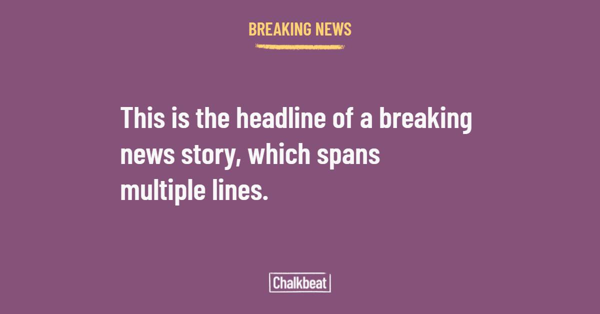 A card generated from the above markup.
Each brush is positioned and configured using attributes, including a default value. Most coordinates are expressed as normalized values from zero to one, so that we’re not locked into a single canvas size, although “aesthetic” settings like padding and image width are in pixels. It’s not dissimilar to working in a format like SVG, which is intentional: markup like this should be readable (and editable) by designers and other non-development team members, in case we want to add new templates or tweak an existing setup.
Remember, however, that we only loop through the children of the form element when rendering. This gives us the ability to define wrapper elements that delegate rendering to their children in specific ways, such as our vertical spacer and stack brushes. When their draw() method is called, these brushes use the getLayout() methods to find the heights and widths of their child brushes, then set the canvas transform before calling draw() on each child to create “flex” layouts (with equal spacing between items) and linear text sequences, respectively.
Here’s a quote card template, which combines two wrapper elements to space blocks equally apart, while stacking the quote, horizontal rule, and attribute in the middle:
<vertical-spacer padding="20">

  <series-logo id="series" color="accent" x=".5"></series-logo>

  <vertical-stack dx="20" anchor="top" x=".1">

    <text-brush
      id="quote" quoted wordcount
      size="60" width=".8"
      padding="0 0 20"
      value="Insert quote text here."
      >Quotation</text-brush>

    <image-brush
      recolor="accent" align="left"
      src="./assets/Chalkline-teal-dark.png"
      ></image-brush>

    <text-brush
      id="name" size="48"
      bold color="textAlt"
      padding="12 0 4"
      value="Firstname Lastname"
      >Attribution</text-brush>

    <text-brush
      id="title" size="36"
      italic color="textAlt"
      value="Title/affilation/etc."
      >Title</text-brush>

  </vertical-stack>

  <logo-brush x=".5" align="top" color="text"></logo-brush>

</vertical-spacer>
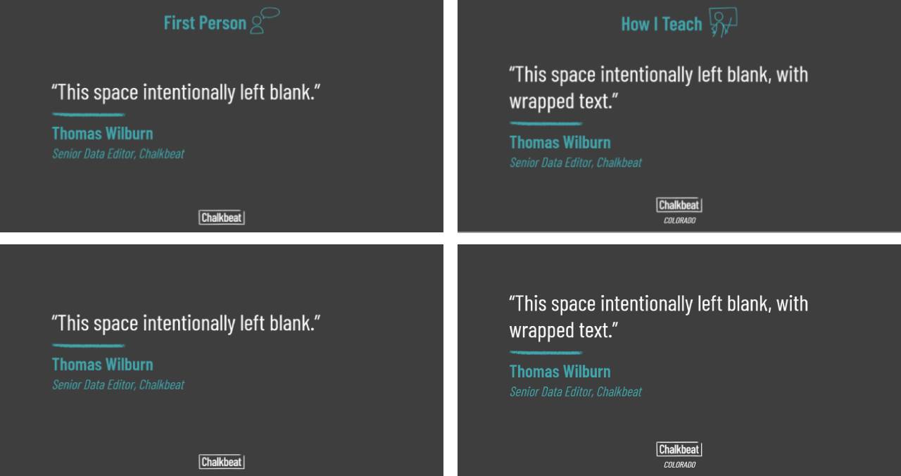 Vertical spacers and stacks ensure that the quote text block is always vertically centered in the available space, regardless of whether a series logo is present or if the Chalkbeat logo includes a bureau tag.
Although this pattern seems obvious in retrospect, it was a relatively late addition. I had originally designed brushes to have a “follows” attribute, in which each element would use another as an anchor for positioning. Getting this to work required a lot of duplicated code, especially as different brushes would size themselves in different ways or need to be vertically centered against multiple other blocks. When I realized that a wrapper could handle all of those cases in a single place, it radically simplified the code — and the markup inside the templates.
Form begets function
While the HTML templates mimic the display tree of an SVG, we also need a way for application users to add the text or image associated with each brush, or it’s not much use to us. However, this is where custom elements can truly shine, since they can display their own UI via their shadow DOM. A text brush, for example, provides a <textarea> and a word count display (unless the noform attribute is set). As a result, the template for each layout in Tarot isn’t just an abstract display tree – it’s also the visible form that users interact with in order to generate the final card.
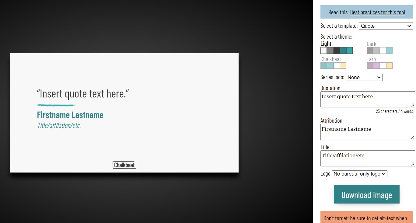 Everything on the right between the theme selector and the download button is generated by the display template.
Brush elements are responsible for monitoring their own UI and dispatching “update” events when those change (usually using invalidate(), which is inherited from the Brush base class). Tarot watches the form element for these events, and schedules a render when it sees them come in. Wrapper elements place their children in a <slot> so that they’re still in the light DOM, and the events bubble up normally.
The result is a UI that largely runs itself. The code that loads templates asynchronously and handles this render loop is currently a relatively unstructured (but short) “top-level” module. Individual elements are loaded from files that contain just the rendering code and UI templates for a particular brush, making them nicely encapsulated (no giant, monolithic render() here) and potentially testable. A separate definitions module sets up color themes and provides utility functions for accessing them.
At times, building a canvas app this way felt like cheating. Coupling the render layer with its configuration in shadow DOM means that there’s no need to worry about keeping the UI in sync with the design – if you place a new item in the display tree, it’ll add form elements to match automatically. It’s hard for me to think of another front-end framework that could pair both sides so easily.
Tarot reading
One weakness of social cards, and of social media promotion in general, is that it’s often inaccessible: putting text into images to work around character limits or pull in readers runs the risk of excluding screen readers. I wanted to make sure that we avoided that, so all brush elements in Tarot have an “alt” getter property that returns their text contents, if any. Wrapper elements return the combined alt text of all their children. The resulting block is shown at the bottom of the UI, right under the download button.
Still, for all that we were able to solve a lot of problems in Tarot, at times its DOM markup fell into an uncanny valley where it looked like HTML or SVG, but didn’t act that way. It was definitely the right decision to support CSS-style position strings for padding, where you can specify up to four values for the top, right, bottom, and left sides. But mimicking CSS meant also realizing sometimes how easy it is to take browser layout for granted. I don’t know if I’ve ever appreciated flexbox as much as when I had to build my own version.
The final interesting aspect of Tarot is the way it neatly highlights the value of class inheritance. In JavaScript, classes have always gotten a skeptical treatment, and parts of the community have certainly leaned more into the functional side of the language. However, being able to share functionality across brush elements – and to create specialized subclasses for image recoloring in the logo brushes – shows that there’s a place for classical inheritance even in an application of this size.
For example, the elements for images, the Chalkbeat logo, and series logo selection all need to recolor their rendering to match the theme, so that a purple card in the “Taro” theme doesn’t have an illegible green series logo on top. By designing the image brush to do this recoloring, the logos are able to simply inherit that functionality while overriding the UI and drawing functions for their particular use cases.
Ultimately, social card generators don’t have to be revolutionary. At best they’re icebreakers, at worst they’re utilitarian. But there’s something to be said for executing small things with elegance, and I think Tarot manages that quite well.