How we collaborated across teams to create a COVID-19 protocol flowchart
Applying ArchieML to the dailygraphics rig for mobile-friendly, accessible interactives
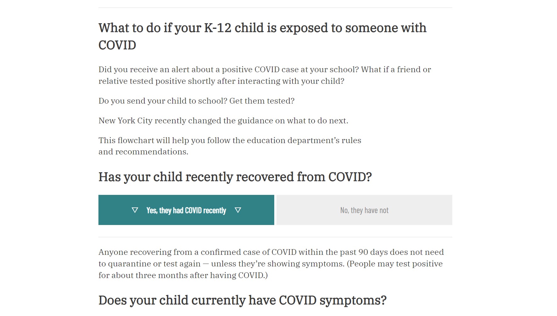
COVID-19 protocols in schools have changed at a dizzying pace since school began in the fall. The rules and regulations have also bordered on arcane, with their long lists of conditionals and caveats.
Chalkbeat’s New York bureau wanted to conjure some order out of new protocols. The rules were spread across multiple pages on the New York City website, the CDC guidelines, and individual school explanations of how the scattered rules should be interpreted.
Whatever we designed needed to be revision-friendly, so that it didn’t become totally obsolete the instant a quarantine length changed. It also needed to fit into a collaborative workflow between the reporters and editors who best knew New York’s rules. And ideally, it had to be accessible and mobile-friendly, too.
Some schools tackled the problem by producing flowcharts like this one from an elementary school in P.S. 9. Similar charts can easily be created with a tool like Miro, Scapple, and numerous other software.
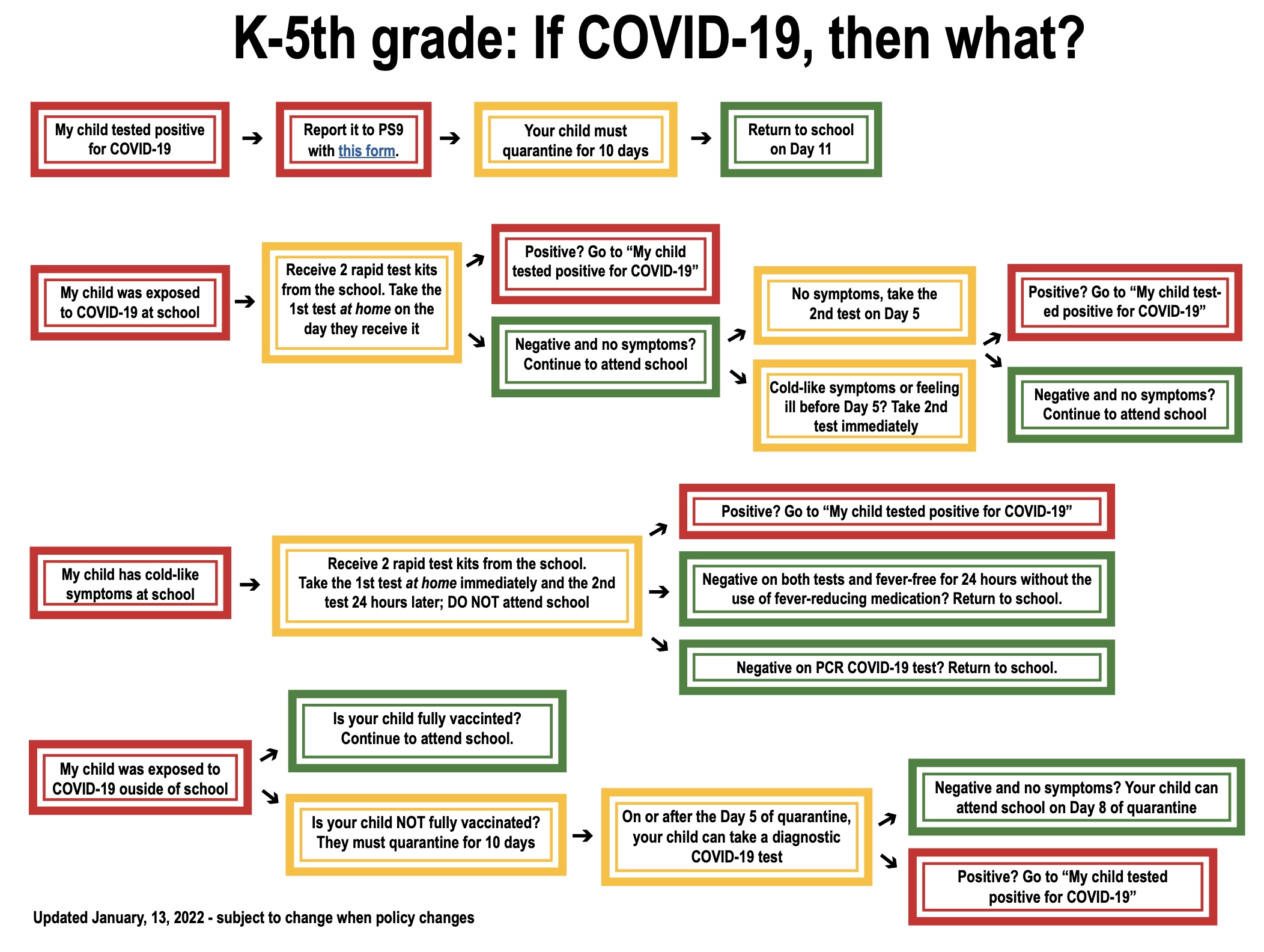
But flowcharts like this can be time-consuming to revise if the rules change too drastically, and the size limitations don’t accommodate more extensive exceptions. The majority of people reading these will also be on their phone, and these static images aren’t responsive. You may have to zoom in and swipe to follow the text on mobile.
Plus, the more potential outcomes or decisions, the more unwieldy and unreadable the image gets — especially for those phone users. Multiple paths might reuse the same language (as with the “Positive?” block above), taking up valuable space and making a flowchart harder to read. And, if those instructions change, you have to update them in three places.
So instead, we built this interactive.
You can find it in its final, published form (complete with an intro) on Chalkbeat New York’s website.
Collaborating with a subject expert
Initially, we asked the reporter, Amy Zimmer, to create a draft version of the flowchart text. She wrote a suggested path, layout, and sample text. Of course, by the time she’d finished, the rules had changed again, requiring a bit of revision as we translated the text for the graphic.
But with a document like that as a starting point, we could make a few judgment calls to rearrange the paths, based on the reporter’s in-depth knowledge of the rules.
For example, Amy provided the following text:
Is your child vaccinated?
No, my child is not vaccinated:
Unvaccinated students will be required to quarantine. The length of quarantine can vary. Students can take a COVID test on Day 5, and if the result is negative, they can return on the eighth day of their quarantine. Otherwise, students must remain quarantined for 10 days.
Yes, my child is vaccinated.
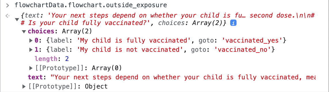
We converted this to an ArchieML block that looked like this:
{flowchart.outside_exposure}
text::

Your next steps depend on whether your child is fully vaccinated, meaning that
two weeks have passed since receiving their second dose.

## Is your child fully vaccinated?

::text

[.choices]

label: My child is fully vaccinated
goto: vaccinated_yes

label: My child is not vaccinated
goto: vaccinated_no
Within the ArchieML document, an object named flowchart contains individual flowchart items by name, each of which can have a headline string, a text string, and an array of choices, which consists of objects with label and goto keys.
This syntax is loaded by our graphics rig in this structure (for the first flowchart item):
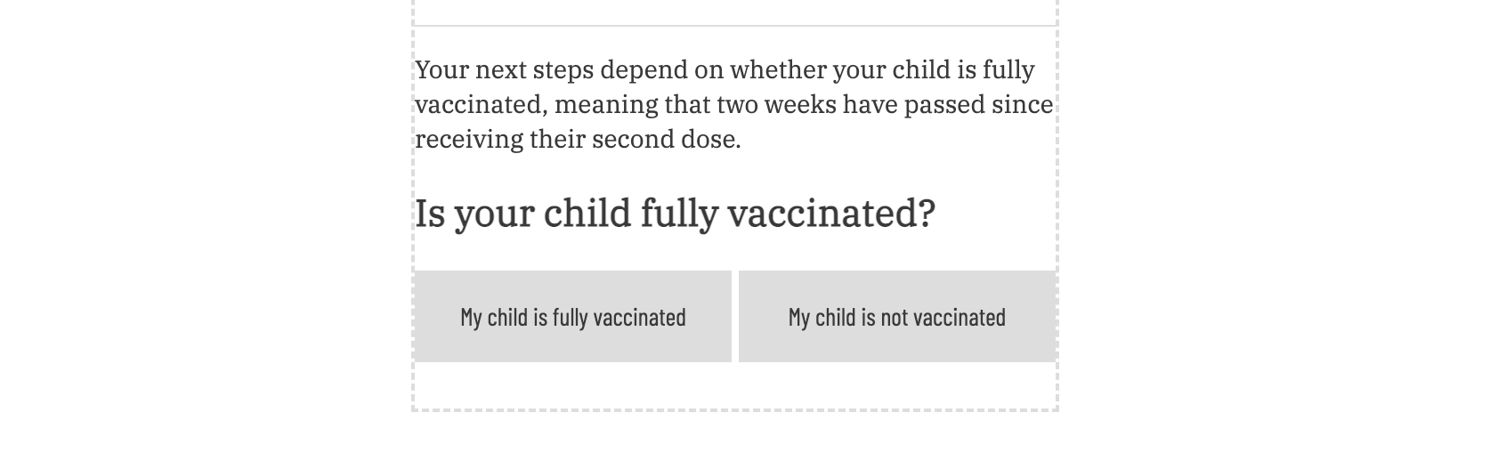
And renders like so:
Once this is all set up, it’s both machine-readable and human-readable, which allows a newsroom developer and a reporter to both jump into it and edit quickly if the flowchart needs to be updated.
We saw this in action when New York announced new quarantine rules about a week after we initially published — the reporter suggested revisions directly in the document; then I pushed the changes. The entire process was extremely smooth, and we had the graphic updates ready to go before the full web post was finished with edits.
How it works
You just need a few things:
- a graphic template that can parse ArchieML (we initially used the NPR Interactive Template, then added ArchieML functionality to Chalkbeat’s version of the dailygraphics-next rig)
- about 30 lines of JavaScript, which create the flowchart container and append new sections after each choice selection, and another 25 lines of EJS templating (which you can view on Github)
- a subject-matter expert, whether that’s you or a reporter, who can help make sense of the options and wrangle the text into an elegant, efficient flowchart setup
NPR’s Dailygraphics rig doesn’t handle Google Docs or ArchieML by default, so we added it for this graphic, using the Betty parser (which supports the explicit multiline strings with the text:: … ::text syntax). A document has to be manually added to the manifest for the graphic, but after that it’s available in the local preview the same as a Google Sheet.
Behind the scenes, these blocks are actually rendered as <template> tags in the document, with IDs matching each flowchart key. When a user selects a button on any given flowchart choice, the script clears any following blocks, finds the correct template matching the goto value for that choice, clones it, and appends it to the container. Template tags are an unusual choice for this, but they let us quickly and easily create new sections of DOM in any order, and even repeat them if required for the flowchart pathway.
How we determined the paths
There are basically no restrictions on the number of paths, nodes, or choices you can create. However, we wanted to keep ours tidy, with mobile-friendly styling, so we ultimately constrained ourselves to two initial paths from the first node.
One path is the most common route, and splits into several other paths depending on where someone was exposed to COVID, whether they were vaccinated, and whether they have symptoms. Many of these paths reuse identical language, so even though you can “click” on many options, there are only around 10 actual text blocks being used interchangeably.
The other path is a miniature route handling a “quarantine exception” rule for students who’d recently recovered from COVID — none of the usual rules applied to them, so we needed a separate route that uses slightly altered versions of all the other language.
The key conceptual questions I asked throughout:
- What are the main points that cause divergence?
- How can we consolidate those divergences under the smallest possible number of paths?
- Which language is the same, regardless of how we arrived there?
- Can I delete or combine any of this to make the choice options more streamlined?
A few of these decisions were reasonably obvious. For instance, anyone who’s quarantined is quarantined for the same reason, so we can reuse that text. And the guidance for what to do if you’re symptomatic is the same regardless of how or why you came to be symptomatic.
If you’re working on something similar, you can spot overlap like this if you start having to make identical edits to several entries at the same time. This can be an easy cue that they’re serving the same purpose in the flowchart.
Other decisions were more complicated, because in some instances the easiest, most obvious solution was to create a third or fourth path at the start of the graphic. However, that crowded the starting menu — and in some cases, introduced a situation for users where two of the paths could both be true for their child.
Ultimately, I prioritized creating a graphic structure that minimized the number of paths and reused as many nodes as possible, instead of trying to manage four to six routes that all had slightly different language.
Advantages & disadvantages to our method
The biggest advantages for our audience lay in the accessibility and responsiveness: It’s all text, instead of an image, so screen readers can navigate the flowchart directly instead of parsing a pared-down alt text version of it. And on mobile, users can follow the flowchart easily.
On the production side, you can build a path, with a series of nodes and choices, out of your text in any order — not constrained by the linear relationship between paragraphs in your text document. This means you can write your choices in any order, then assemble and even reuse them regardless of that order.
This brings a few big benefits.
First, we can reuse the same choice text across all of our paths. This is useful, for instance, if the text for “you must quarantine” has the same text under every single condition, but could be triggered under multiple different circumstances.
Second, when we have to edit or update choice text, this means we only have to edit in one place. However, the change will render in every place that we reuse that same choice text. Efficiency and accuracy!
Third, the bulk of this graphic is built in more or less plain text. There are a few ArchieML syntax cues, but they’re largely intuitive. That makes working with reporters and editors far easier. Instead of onboarding them onto a new software or tool, or sending them a finished product and asking for edits, they can just go directly into a Google Doc and make changes themselves.
Unfortunately, while the flexibility and lightweight syntax of ArchieML makes it great for creating structured data, it can be hard to get a high-level view of exactly what leads to where in the flowchart. Because you have to click through all the options, it’s hard to get a mental idea of what the paths look like — they’re all just a single column of question/answer pairs.
Also, because the structure of the paths is not necessarily linear, it can be difficult for editors or reporters to jump directly into the ArchieML and make higher-level structural edits. (That’s where the collaborative process comes in.) You’ll want to allocate time for a developer to set up the document, and be available to add/remove nodes as reporters revise the document.
It would be great to present an actual visual flowchart in places where the screen size is available, so we’re hoping to add an SVG rendering path in a future version, even if it’s just for internal use. That could address both of these workflow limitations.