Utilization, iteration, and visualization
How we collaborate with Chalkbeat bureaus to create more effective, reader-focused graphics
Public schools around the country have seen declining enrollment, and small schools spend far more per student, making them a financial strain on districts. However, school closure decisions are controversial and often disproportionately impact marginalized communities.
One school district facing declining enrollment and tough school closure decisions is Jeffco Public Schools, and Chalkbeat Colorado wanted to help local readers understand how those decisions would be made, and how their school specifically would be affected.
Chalkbeat reporter Yesenia Robles obtained data on enrollment and utilization (the percent of a building’s capacity that’s in use) from the district and identified five key takeaways from the data, which we then set out to visualize.
One of the takeaways — that schools with lower enrollment and utilization tend to have a higher concentration of students living in poverty — presented a series of challenges. First, there were too many schools to visualize all of them individually, so I tried out this graphic presenting averages.
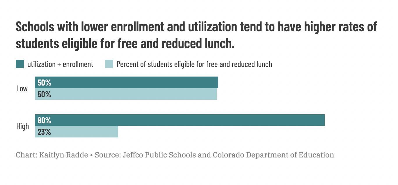
However, explaining what this means gets convoluted quickly. Let’s break down what’s going on in those grouped bars:
- Low (schools with less than 60% utilization and enrollment under 250)
- Average utilization: 50%
- Students eligible for free and reduced price lunch: 50%
- High (schools with more than 60% utilization and enrollment over 250)
- Average utilization: 80%
- Students eligible for free and reduced price lunch: 23%
It shows the disparity between high and low utilization schools, but you really have to think about what those bars are showing — it’s a lot of numbers to keep track of.
To avoid the issue of having so many percentages floating around, I tried a different approach, presenting the number of schools in each category serving mostly-FRL-eligible or mostly-not-FRL-eligible students.
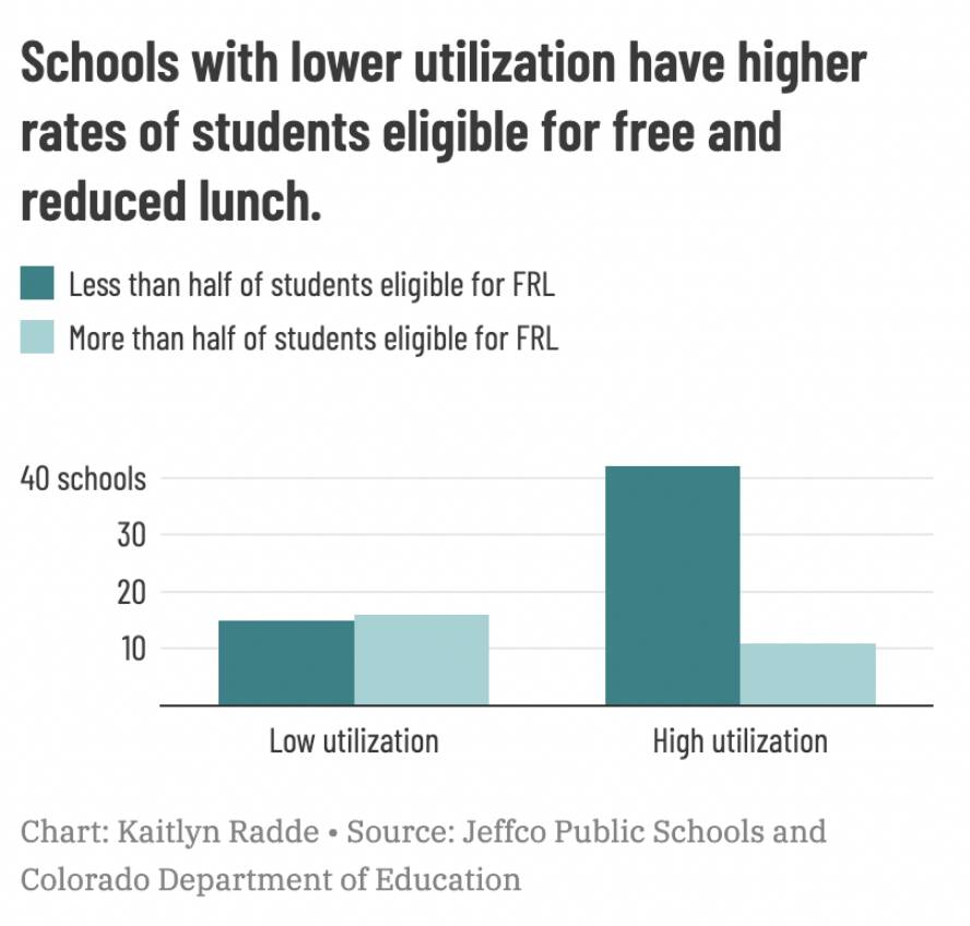
But, as bureau chief Erica Meltzer pointed out, that high bar on “high utilization” paired with the headline on the chart makes it look like it’s showing a lot of students on free and reduced price lunch if you’re not reading every label carefully.
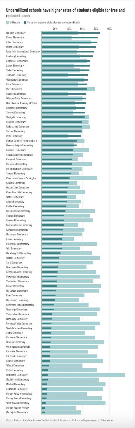
That brought me back to my original idea, which used a bullet chart to pair the two metrics together. It was way too long to be meaningful or useful, especially since most of our audience reads our stories on mobile devices, so I hadn’t even bothered to send it to Yesenia and Erica at first.
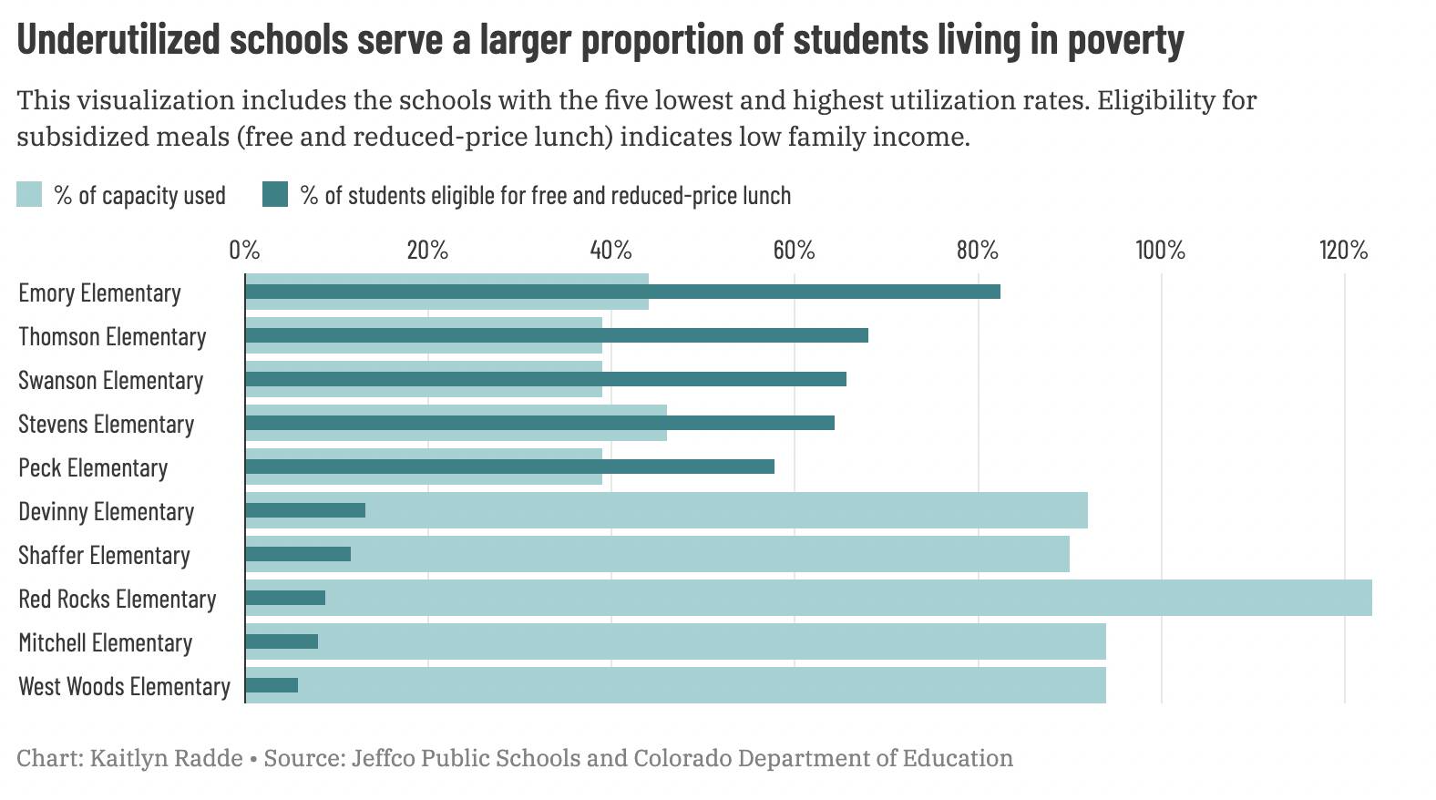
The benefit of sharing this bad graphic was that it clearly captured the disparity we were interested in, so we were able to use it as a jumping off point to discuss how to pick representative schools and make a more manageable version. We chose to select the schools with the five highest and lowest utilization rates, which we ultimately published.
Mocking up several ideas and trying out different approaches — even ones that were obviously not going to be good final choices — helped to jumpstart the brainstorming process and land on a better visualization faster. The newsroom’s subject matter expertise ensured that the graphic we settled on was methodologically appropriate and easy to understand, and frequent communication prevented me from spinning my wheels in less useful directions.