How we analyzed disparities in Arizona's federal-only voter rolls
Using unified shapefiles, voter registrations, and PostgreSQL to evaluate voters' likelihood of being blocked from casting a full ballot.
Last year, Votebeat reporters documented how Arizona’s federal-only voter laws could be preventing college students from voting. After publication, Secretary of State Adrian Fontes also suggested that the laws disproportionately target voters living on tribal lands, too.
With the November election in sight, we wanted to revisit the federal-only voters list and verify whether these disparities persisted. However, that task poses a number of technical problems, especially if we want to answer the question statewide.
Arizona administers elections at the county level. That means that certain types of voting data, such as precinct geographic boundaries, have to be obtained directly from the county governments, some of whom don’t make it publicly available. Even when data is available, it may be in dissimilar formats that require reprocessing before it can be combined across counties.
That means if we want to ask basic questions like, “Who’s likelier to end up on the federal-only voter list?” our options are limited — especially on a tight deadline, with just a few days between the election and the release of finalized voter rolls.
To conduct this analysis, we acquired digital map files (these are often referred to as part of a Geographic Information System, or GIS) from each county individually. Then, we standardized and combined those files with a graphical, open-source toolkit called QGIS.
To calculate disparities at the precinct level, we analyzed a few different combinations of data. The bulk of our analysis compared registered voters to our federal-only voter list and precinct maps. This gave us an estimate of how many eligible voters lived in each precinct. Then, we used a geospatial database called PostGIS to overlay the tribal census tracts, which don’t neatly overlap with precinct boundaries, with that registration data.
Spoiler: We did find that voters living on precincts that contain tribal census tracts and college campuses were much likelier to be on the federal-only voter list.
Step one: Let’s make a state map
First, we contacted every county’s geospatial team if they had one, or their recorder’s office if they didn’t. About one-third just sent us GIS maps of their voting precincts, and waived the fees. (Thank you!) The others tried to charge us, or didn’t respond. We had to apply some creative methods to obtain publicly available GIS files maintained by official county sources.
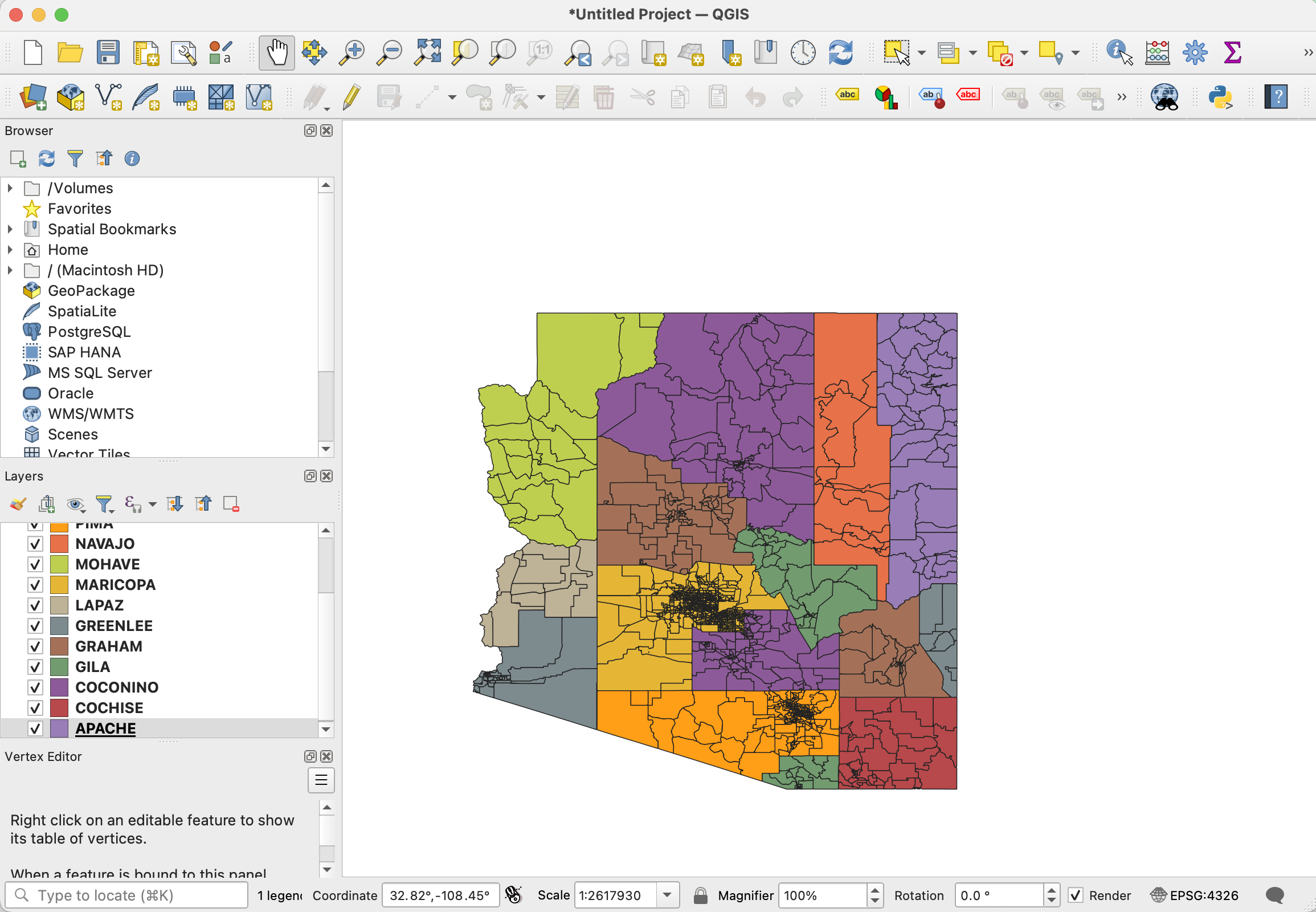
Files in hand, we ran them all through QGIS’s “verify geometries” check and fixed a few shape issues. In two cases, this meant manually fixing incorrect precinct boundaries whose shapes were deleted during the automated repair process. This is why it’s important to check geometry against geographic attributes at the end of any processing step.
Turning precinct parts into precincts using ‘dissolve’
A common issue when using heterogeneous voting boundaries: Precincts may have smaller precinct parts. Some of our maps included precinct parts, and others didn’t. These sub-precinct boundaries were too granular for our analysis, and also not very useful since we didn’t have them for the whole state. So we “dissolved” them (a GIS term of art for combining multiple shapes into one) to generate full precinct shapes instead, based on the precinct attribute. If the parts were missing a separate precinct column, generally we were able to procedurally extract the precinct name or number from the precinct part name.
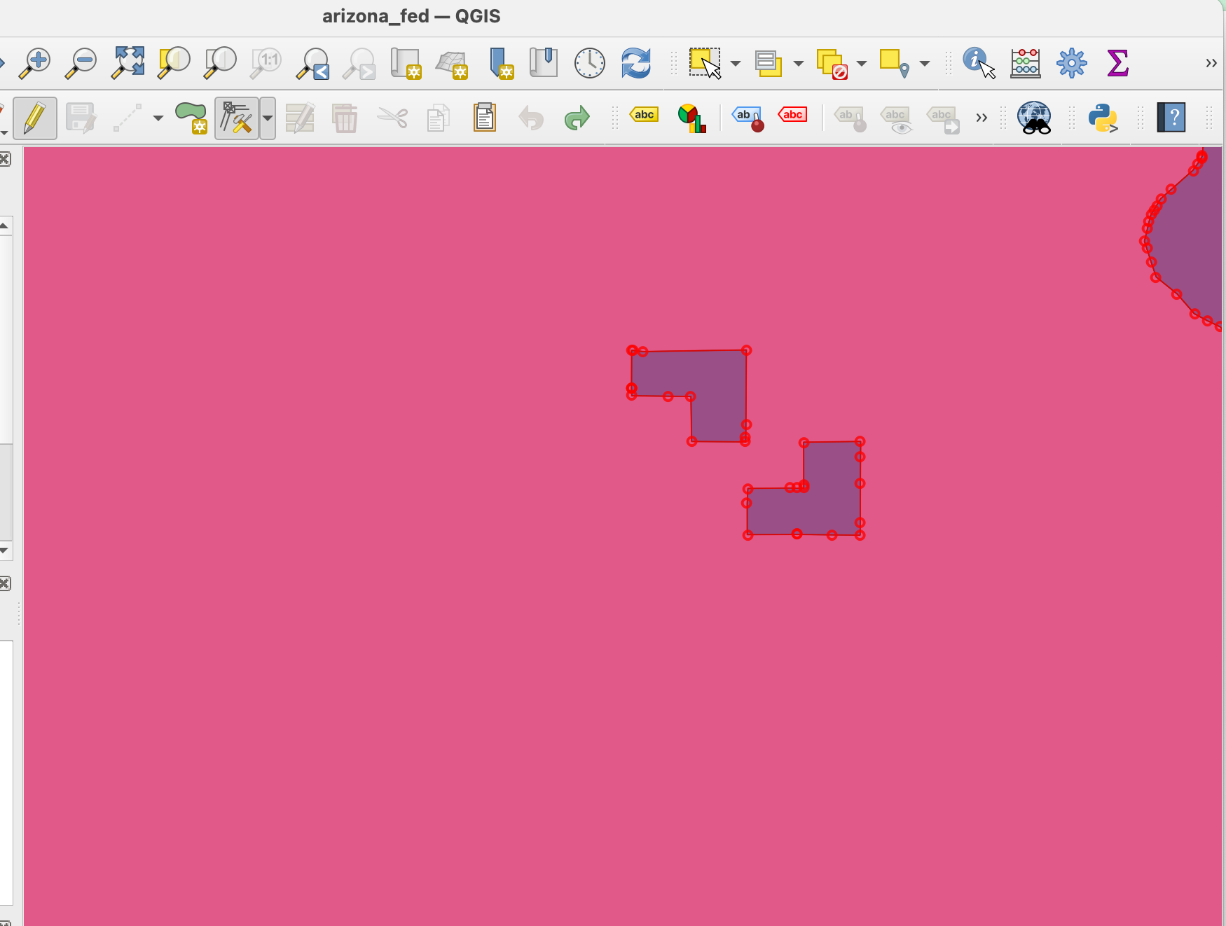
At this point, we made more manual fixes with the vertex tool to clean up messy lines that might have resulted from the dissolve.
Combining shapes and columns
OK, so let’s say we now want to combine the shapes. Except … they’re all from different counties, which means every single one has a different attribute schema based on whatever the counties felt like naming their columns. We want one column for all of the county names, all of the precinct names, and any other associated data.
Bad news: QGIS, the graphical shapefile editor, really hates that.
Worse, it doesn’t really accommodate easy combination or editing, once you’ve imported a shapefile. Frequent QGIS users may have encountered the software’s supposed “renaming” features (or the lack thereof). Creating new columns for a shapefile or two, then merging them, isn’t too much of a burden. But unifying 15 shapefiles with entirely different attribute schemas? Ick.
Mapshaper saves the day on this one.
You can run this handy utility on the command line locally or use mapshaper’s online UI. Personally, I preferred the ‘Console’ view on mapshaper.org, as it gave me the ability to make sure my schema made sense as I went along — and to actually see the attribute field updates as I make them.
Mapshaper’s documentation can also be spotty, so it gives you a chance to try things and make mistakes until they work.
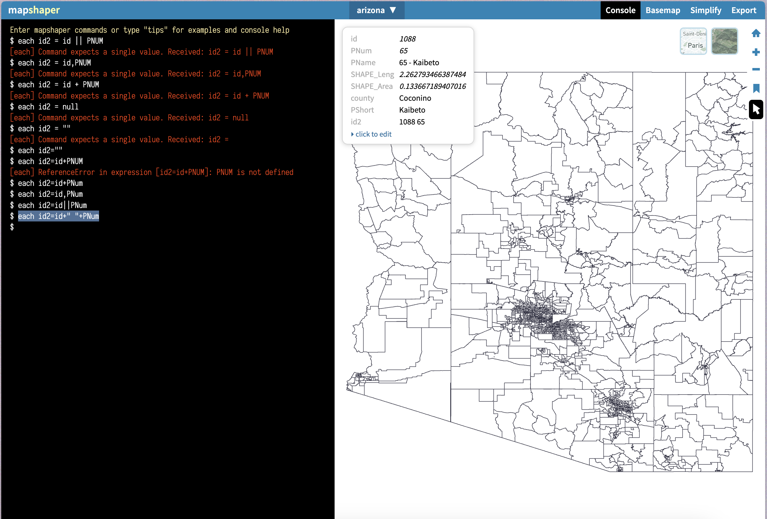
Make sure to load the full shapefile package, which should include .shp and an associated .dbf file that contains the attribute information, as well as the .prj data.
To start, reproject all of the shapefiles into your preferred coordinates system.
-proj wgs84
Renaming fields is easy:
newname=oldname
You can also rename multiple fields at once.
-rename-fields PNum=CODE,PShort=Precinct,id=OBJECTID_1
We also added a county text ID to keep track of the files.
each county='Yuma'
Finally, we filtered down to the fields we’d like to keep.
-filter-fields id,PNum,PShort,PName,Shape_STAr,Shape_STLe,county
I also created a standard concatenation between county and precinct names, so that we had a unique ID for each precinct in the geospatial analysis.
each PName=id+" "+PNum
At some point, you’ll need a file that has all the same fields in a consistent order. But you don’t need to worry about creating NULL fields in mapshaper; the columns will be standardized when you merge the layers and export into a .shp format.
There are ways to use the Mapshaper console to merge your files and layers. I preferred to export each county as a separate .geojson and continue running Mapshaper locally across all the files, instead:
npx mapshaper -i geojson/*.json combine-files snap -o arizona.json format=geojson combine-layers
This command instructs Mapshaper to grab all .json files in one folder, combine them, snap vertices that occupy the same geographic space, and then merge all layers into a single output file.
At this point, you can convert your .json into a shapefile using your preferred method. (I loaded the statewide file into the Mapshaper web console, exported it as a shapefile, and checked it over in QGIS.)
Note that in your .json file, your properties will not be in the same order, and any columns that don’t exist in a given county’s .json will not be created or populated during the merge.
To illustrate this, I started with the tribal census tracts designated by the U.S. Census Bureau — which works with tribal officials to develop a map. It seemed important to acknowledge the Nations’ actual boundaries as much as possible, instead of cutting them off at the edge of Arizona’s governmental boundaries. I attempted this process a few times to try to find the best way to illustrate the relationship between the Navajo Nation and the state of Arizona, in particular.
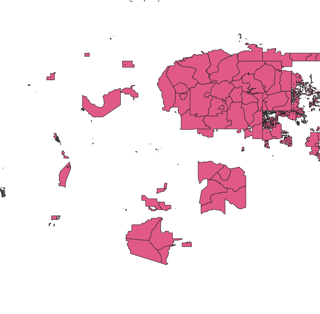
Then I subtracted the land areas from a state map of Arizona and stitched the two geographies together.
npx mapshaper precincts_for_erase.shp -erase precincts_to_keep.shp -o out.shp
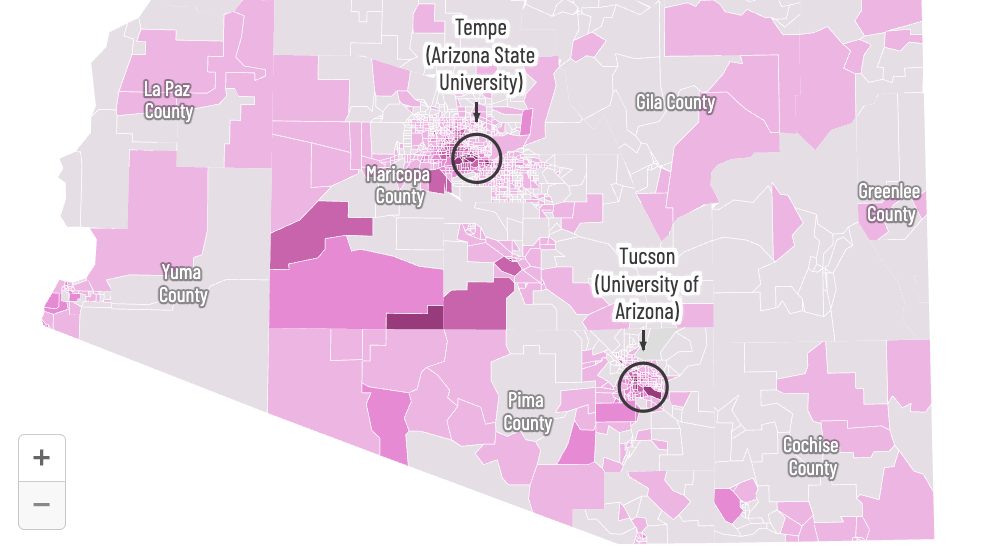
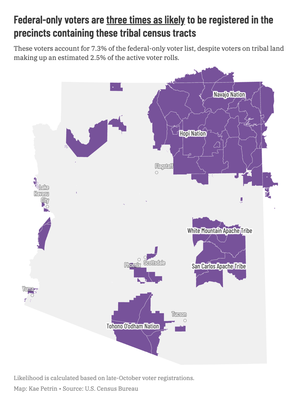
That left us with something that Datawrapper let me turn into the following map:
Step two: Let’s analyze
Why’d we do all this, again?
Paying for the entire state voter roll was far out of our budget. We had the federal-only voters, but they only represented around 1,500 precincts — there were 0 voters in a chunk of precincts. And we knew there are more than 1,700 precincts.
That meant two things:
- We would’ve needed to do this entire analysis using Census Citizen Voting Age Population estimates for each precinct as the denominator.
- The best way to get a somewhat real list of all the precincts in the state initially seemed like it would involve pulling them out of map attribute data — if we wanted to avoid wrangling them out of poorly formatted PDFs or individual county registration records.
Luckily, we restrained our request to precinct-level data, instead of person-level data. That brought the cost down significantly. It also gave us a statewide list of precincts. This turned out to be a good thing to have, because the state’s PDF count of precincts, the state’s spreadsheet registration records, the county GIS files, and officials also all gave us slightly different lists of precincts. The map was ultimately a good way to check our totals, even though we could have conducted a precinct-level analysis without it. We also used our Census estimates as a comparison point to check that our registration totals seemed reasonable, and vice-versa.
That just left us with one remaining question we couldn’t directly answer: Were voters living on tribal land more likely to be denied the ability to vote in local elections?
As I’ve mentioned, the major Native nations don’t adhere to U.S. state, county, or precinct boundaries. So, we used the tribal census tracts and calculated the geographic overlay of the precincts in PostGIS, a SQL-based geographic database tool.
We’ve used a similar method in a few other places, and it has served us well.
drop table if exists ttract_fed_intersections cascade;

create table ttract_fed_intersections as (
    SELECT
    ttracts.geoid,
    precincts.PJoin as pct_precinct,
    Active as active_fed_only,
    act_reg as active_registered,
    ST_AREA(ST_INTERSECTION(ttracts.wkb_geometry, precincts.wkb_geometry)) / ST_AREA(ttracts.wkb_geometry) AS overlap
    FROM
    ttracts,
    precincts
    WHERE
    ST_INTERSECTS(ttracts.wkb_geometry, precincts.wkb_geometry)
);
This took some time to walk through with quality assurance tests.
We made some assumptions here. For one, since the federal-only voter roll is so small, we treated any federal-only voter on a precinct that contains tribal land as a potential voter on tribal land.
On the flip side, total registered voters was much higher. So we assumed that registered voters were evenly distributed throughout the precinct. If half a precinct was on tribal land, half of the voters were assigned to tribal land, and half were not.
We were worried that this would overestimate the federal-only voters living on tribal land. So we tried a few other methods, and found that one of the alternative methods vastly overestimated the number of total registered voters living on tribal land when we checked those numbers against information from the nations. With that exception, we found similar trends when we tried other methods, so we decided it was a fair approximation.
Step three: Spreadsheets galore
After obtaining six different versions of the various datasets, each of which had a new and fun limitation, we were ready to finish the analysis with a relatively straightforward comparison. We joined that data to the shapes based on precinct names, which were thankfully consistent across all of the state’s data, even though they were inconsistent in the maps. Then, we compared federal-only voters’ various behaviors — registration, active versus inactive, ballots cast — to the comparable statewide registered voters.
With the exception of the final vote tallies, which required a quick rollup in a data notebook tool, that analysis only required standard spreadsheet pivot tables.
We ran into a few issues, almost entirely all by virtue of Arizona’s methods for producing voter records: Each spreadsheet they sent us was a live pull, which meant that if they sent us one group of voters a week before the second group of voters, the numbers weren’t exactly 1:1. Voters’ statuses on or off the list could change, or someone who was on the federal-only list could have verified their citizenship, and so on.
As a byproduct of that, as well as the high cost of acquiring all data on individual voters, we couldn’t obtain person-level data for everyone who cast a ballot. This meant that we didn’t have detailed information on which precinct 545 federal-only voters lived in.
The vast majority of our analysis looked at the voter rolls prior to election day, not at who actually showed up at the polls, so this wasn’t a huge issue. We ended up including them in overall numbers, like the rates of how many federal-only voters cast ballots, but excluding them from geographic analysis of how many voters showed up at the polls in specific precincts.
Step four: Retrospective
If I had this to do over again, I likely would have moved the bulk of the initial pre-processing out of QGIS — since I essentially had to re-do most of it in a Python script that would execute all of the necessary Mapshaper commands on command line.
Especially if there’s a delay in the reporting process, or an update to the data, an all-Mapshaper project structure is a vast improvement over a QGIS workflow. QGIS has a lot of nice quality-of-life features, but it just doesn’t measure up for documentation, replicability, or iterability. It’s also hard to revisit what you did in QGIS, since (like most graphical tools) its records of steps are not as accessible.
We knew this would be an asset that we reused for future analyses. Our reporters often want to ask questions like this, and we’d already done one story where not having the asset meant that we couldn’t use data to prove a few things we were pretty sure were true. So it’s a good long-term time investment to take the time to do it right, and to have something reusable.