
Data Crimes of 2023
Here are the worst things we did to process education data this year.
As data journalists, we’re used to patching together a workflow from whatever tools we can lay our hands on, but there’s a fine line between Macgyver and MacGruber, and sometimes we cross it. Since we think it’s a good thing to share not only our triumphs, but also our hall of shame, here are some of our most duct-taped solutions to reporting problems from 2023.
(Suspiciously, almost all of these are related to processing dashboards.)
Thomas: Deleting 16,000 empty columns in Excel
Most people don’t know that Excel supports a maximum of 16,384 columns (that’s 2^14, for my real binary fans). It’s hard to imagine a scenario in which you would ever need that many, which is why it took me by surprise when I ran a set of spreadsheet files through a CSV converter in order to merge them, and discovered that the file size had ballooned from ~1MB to half a gigabyte, the vast majority of which was trailing commas.
When I opened the files in Excel, they looked normal: columns A through Q had the data that I would expect, and there was nothing to the right of Q. However, when I moused over the header and tried to resize the last column, I discovered that what I thought was a normal header row at the top of the table actually extended all the way out to near-infinity (with labels like “Cell 13678”), and it had simply been hidden by setting the column width to zero past that point:
 oh no
oh no
Excel can handle these files just fine, because it doesn’t care about sparse ranges, but any of the tools that I normally use for combining data (such as openpyxl or xlsx2csv) try to get the full width of the sheet, see these hidden header cells extending off into the distance, and work themselves into a frenzy adding empty commas to every line of actual data.
I tried a few processing tricks to handle these files, before finally turning to my tool of last resort: Visual Basic for Applications, the macro language that’s built into Excel itself. Making a new workbook that contained the filenames of all the input files, I then ran this subroutine in the script editor to open each one, delete the trailing headers, and re-save the file.
Public Sub trimSheets()
Dim i As Integer
Dim wb As Workbook
Dim file As String
Dim sheet As Worksheet
For i = 1 To 13
    file = Cells(i, 1).Value
    Set wb = Workbooks.Open(file)
    Set sheet = wb.ActiveSheet
    sheet.Range("R1:XFD10").Delete
    wb.Save
    wb.Close
Next i
End Sub
It’s a hideous, utterly unscalable monstrosity, but it did the trick. Feeding these new XLSX files to our standard tools produced CSV files that I could safely combine into a single dataset.
Kae: Filtering and re-aggregating state report cards
Normally, data dashboards suck, but they have one thing going for them: all the data is formatted the same way over time, with the same column names/headers and consistent output.
Not so for one state. The download files boast 12 separate tabs — which change names from year-to-year — and 1,000+ columns per tab. Those also change names. Fun.
On the plus side, this problem led to a nifty piece of reusable code.
dataset = ['General']
df = []
all_df = []

for data in dataset:
   all_files = glob.glob(output_dir + '*' + data + '*.csv',recursive=True)
   print(all_files)
   all_df = []
   for f in all_files:
       df = pd.read_csv(f, sep=',')
       bad_columns = {"Student Enrollment - Total": "# Student Enrollment",
                      '# Grade 9 Total' : '# Grade 9'}
       df.rename(columns=lambda x: re.sub('Number of ','# ',x), inplace=True)
       df.rename(columns=bad_columns, inplace=True)
       all_df.append(df)
   df = pd.concat(all_df, sort=False)
   df = df[(df.Type == 'District') | (df.Type == 'Statewide')]
   df.to_csv(cleaned_dir + data + '_processed.csv',sep=',')
Sometimes, it only takes one runthrough to pull all the relevant data.
This particular time, it took four separate versions of this code, because the state apparently stopped rolling up school-level data to the district level in some (but not all) years. I had to sum all the schools vertically, then group/sum all the relevant student group columns horizontally, then recreate the unique district ID from the school ID hash. Oh, and some of the 2018 data was just in a 2023 column with “(2018)” appended to the standard column name.
After all that, a particular school district disputed the state’s numbers, claiming they were off by as much as a factor of 10 in one school year. So I pulled out the calculator on the raw, pre-processing dataset. The state’s numbers may well be wrong! But thankfully, to save having to re-run the whole pipeline, our totals weren’t.
Thomas: Extracting ACLU data through the dev tools debugger…
If you’re writing about laws targeting trans students, there are a few datasets available but none of them are particularly great. The easiest to cite in a journalism context is probably the ACLU’s “Mapping Attacks on LGBT Rights” (although, as always, it’s the table we want and not the map). They don’t make this downloadable in a machine-readable format, but it’s scrapable, right?
Well, not really. The page is built in Vue and actually assembled in the browser, with data being passed to the interactive sections via attributes:
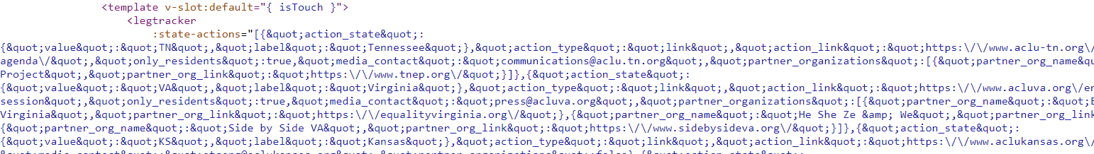
There’s literally thousands of lines of JSON being jammed into the middle of the HTML here. Set aside any critique of the architecture, this is pretty annoying.
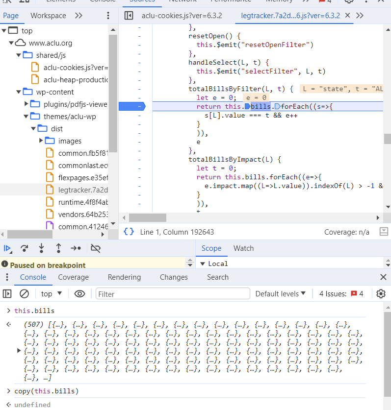
If our goal was to have regular updates of this dataset, we’d need to write a scraper that loads this page, finds these Vue-specific attributes, convert all the HTML entities back into strings, and hope that none of this implementation changes. That’s doable, and not even particularly difficult. But we really only needed this information once. So instead, I opened the browser dev tools, found a reference to this.bills in the JavaScript code, set a breakpoint, and just copied the value out of the console.
I don’t think the ACLU was being intentionally obfuscatory–they just built on the defaults that the framework provided–but perhaps this is a good reminder to us all that there’s not really any such thing as a “secure” JavaScript application if you’re willing to take a crowbar to it in the debugger.
Kae: Tracking schools that change operators, and districts, and also operators and districts
One state that we’ve covered likes to raise existential questions about the nature of schools and districts.
For example, what if a school was a school in a district? And then it was also its own district, for no apparent reason? But it’s also still in a public school district that same year?
And then what if a charter school operator took it over, so it actually became its own district? Also, for some reason, it was also still in the public school district? What if this school just disappeared from school-level reporting entirely for a year, then came back? What if, for some reason, the exact same school was two schools simultaneously in the same year, and one was a district and one was a school?
Oh, and what if some grades were also just a separate school, but only in the data, not in the actual school? What if one school was just a school, no district, and some other school was just a district, not a school? What if all of that was also different between Reading test and ELA/Math test reporting?
What then? Huh?
Normally, the “what if a school were a district, actually” problem is bad enough. But when we’re also trying to legitimately track schools over time for accountability purposes, it becomes a whole extra nightmare.
This is a common data question in a few different cities, where special “turnaround” programs shifted struggling district schools into the hands of charter school operators, or shifted them into specific district-run programs with similar purposes. From a data perspective, these are (usually) considered different schools. But from a student experience perspective, it’s often the same building and the same school.
So how do we capture both the incongruence and the continuity — and answer questions about the long-term outcomes of schools changing hands?
Basic questions like, “well, did the charter operator improve student outcomes?” become pretty gnarly to answer. That’s partially because charter schools often have fewer reporting requirements than district schools, and partially because it’s hard to tell what trends are attributable to a new operator, vs. other outside factors. (Like, I don’t know, a pandemic, remote learning, or a change in test format.)
But some states really want to make a problem out of this.
Anyway, the main solution to this is “lots and lots and lots of data crosswalks, utterly unreplicable copy-pasting, and by God you better hope you wrote all this down,” but I’ll let the project folder speak for itself.
Thomas: Unzipping the poor man’s GZIP
As Kae notes above, dashboards are the ruin of many a data journalist’s week. Over time, you develop a stable of tricks that you can use to extract what you need from them, within limits. So it’s almost a pleasure when, from time to time, you run into something puzzling and new.
My usual routine with a dashboard is to immediately look at the network requests it makes, and see if there’s a straightforward endpoint I can simply copy. To my surprise, one state was loading data from pairs of CSV files: one that contained only numbers, and the other being an “index” file with only one column of text strings:
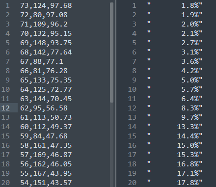
It took a little while to figure out what was going on, but by searching for the values that we could see in the dashboard page, we eventually realized that any time there’s a whole number in the first file, it represents the value at that row number in the second. So if you see “0” in the data, that actually means “1.8%” pulled from the first row of the index file, “1” translates to “1.9%”, and so on down the list.
The best I can imagine is that this approach is meant to be some sort of compression, like the Huffman coding that’s used in ZIP and MP3, which encodes the most common values in a binary tree. But there’s no point to this, since browsers already leverage GZIP compression for requests. It doesn’t really seem like it’s meant to hide anything. Maybe the developer just thought it was clever. And I’ll say this: while it’s still a data crime, it did make pulling data from this dashboard feel a little more fun, for once.